Wednesday, April 29, 2009

Bracketology ctd...


A great response to yesterday's post so here's the full bracket (click to see it full size) and the intro and comments I was asked to write. But please bear in mind that these brackets are more a starting point for debate than any definitive pronouncement. And for those who want more on brackets go to bracketsmackdown.com.

My intro:

Let’s start by saying American photography so dominates the medium as to make other countries’ contribution a footnote. So we’re really choosing the most iconic photograph of all times. And what are we looking for? A visceral image, one that is embedded in our cultural subconscious, one taken with the greatest skill by an artist whose entire body of work is capped by that one transcendent image that is totally unreplicable. One that you can close your eyes and it will come floating into the space between your mind and your eyelids with something between a shiver and a sigh of pleasure.


And comments:

Capa vs. Eisenstadt

Two indelible World War I images, one of war, one of peace, from transplanted European photographers who made their way to America to find fame. Capa’s picture was taken as bullets flew, Eisenstadt’s as confetti streamed down. Victory goes to the photographer who risked his life.


Link vs. Abbott

Two of the greatest night-time photographs ever taken, both technical tours de force. The Abbott is filled with the romance and promise of the big city, the Link with the romance of small-town America and wonder at man’s ingenuity. Link is schmaltzier, which means Abbott wins.


Lange vs. Leibovitz

Head to head go two female heavyweight contenders. Leibovitz’s photograph is not just about a famous couple but is the high-point of her sneakily conceptual imagery – pulling a theatrical gesture out of her famous subjects. Lange’s Great Depression image combining photojournalism and great portraiture has come to symbolize man’s dignity in the face of hardship. Lange by a whisker, if only because she came first.


Adams vs. Avedon

The uber-landscape against the uber-fashion photograph from two of the most controlled artists in American photography. Both pictures, while carefully set-up on large-format cameras, could have only been taken the split second they were taken. Both are perfect in every way. But such is the spirituality in Adams image that it even trumps a beautiful woman and an elephant.

Tuesday, April 28, 2009

Why Am I Showing This Picture?


My friend the super-agent Mark Reiter (he got Jack Welch $7 million for one book so I think that qualifies him as super) is in his spare time a master bracketologist. For those not in the loop, a bracketologist is a maker of lists of 32 items in a given category that go up against each other tournament-style to determine who is the champion of the field. Of course it helps if the list-maker has some credibility and so in his latest book “The Final Four of Everything” Reiter has everyone from film critic Manohla Dargis on the best Clint Eastwood films (Million Dollar Baby) to New York Times court reporter Adam Liptak on the best Supreme Court Decision (Brown v. Board of Ed). As a friend of the family I was asked to do "Iconic American Photographs" on which more later. But my advance copy of the book just arrived and I was pleased to see a number of other photo related lists.

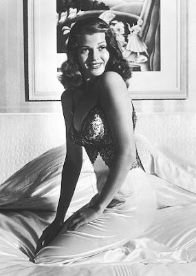
The picture above, the famous shot of Raquel Welch from "One Million Years B.C." was the runner up to Rita Hayworth (below) in American Pinups as bracketed by Gregory Curtis, former editor of Texas Monthly.


Photo by Bob Landis.


Then there’s Celebrity Mugshots by Willie Geist – co-host of MSNBC’s Morning Joe – resulting in a showdown between Nick Nolte and James Brown.


While not included, this earlier mugshot of Brown from 1988 probably deserves an accolade for the most suave mugshot!


Anyway, back to my category – Iconic American Photographs. I’ll give you my final four and you can let me know which you would pick.

In alphabetical order:

Ansel Adams – Moonrise, Hernandez.


Diane Arbus – Twins


Richard Avedon – Dovima with Elephants


Dorothea Lange – Migrant Mother.


The book comes out next week at which point you can join the debate over Best American Wine, Best Political One Liners, Best Motherly Advice, Best Celebrity Baby Name, and 146 other bests (or worsts).

Monday, April 27, 2009

Anon.


Robert Flynn Johnson is the Curator Emeritus of the Achenbach Foundation for Graphic Arts at the Fine Arts Museums of San Francisco. He is also the author of two of the best books on anonymous photography - "Anonymous: Enigmatic Images from Unknown Photographers" (published a few years ago) - and now "The Face in the Lens: Anonymous Photographs" (due for release next week). Together this pair of books make him the John Szarkowski of vernacular photography, the sultan of snaps.

The pleasure of great anonymous photographs lies not only in how they reflect well known images and concepts, but in the freshness and surprise they provide. Take the photo above from Johnson's new book. It is truly a masterpiece . It has humor, a Sander/Arbus/Avedon flair, a surrealist edge, perfect composition, and a wonderful sense of period in the hatted garb of the background figures. Everything about it seems perfect. (Take out the Flatiron looking building in the center background, for example, and it doesn't work as well compositionally.) And this is just one of dozens of great pictures in Johnson's extraordinary collections as you can see from the covers below.


Friday, April 24, 2009

Weekend Video - Gucci Flora


This just released ad for Gucci’s Flora perfume was shot by film director and video artist Chris Cunningham. Known for both his art and commercial work, Cunningham’s best known video, Björk's "All Is Full of Love" won multiple awards, including an MTV Music Award for Breakthrough Video and was nominated for a Grammy for Best Short Form Music Video.

The Gucci film, starring Australian model Abbey Lee, was shot in Latvia over a four day period and the flower field was comprised of more than 20,000 fake flowers. The music is a strange new version of the disco classic “I Feel Love” specially re-recorded for the ad by Donna Summer.

And here's a bonus making of video:


Thursday, April 23, 2009

Where Content is King


What photos do I buy for myself? The most recent photograph I bought was a large (50 x 60 inch) print of this image of Paris by Sze Tsung Leong. I actually had no intention of buying any such picture, but I walked into the Yossi Milo Gallery a few weeks ago and it just leapt of the wall at me. (Bear in mind that the j-peg can’t do justice to the actual print which is breath-taking, but please click on the image to see it larger).

I have no special affection for Paris, no empty space looking for a picture this big, but when something really clicks at first sight and holds up on a second viewing, and you can scrape together the money,
I say buy it! (In today’s world it has to be a much safer bet than any stock.)

Sze Tsung Leong came into prominence with his series of horizon pictures taken all over the world. The horizons very specifically lined up in the same place in every picture so you could mix and match them into any length you wanted, and while they sold like hotcakes, it all seemed a little obvious to me. Leong’s earlier works, however, black and white circular pictures of the Yangtze River, and his slightly later architectural pictures of Chinese structures - showed a promising new talent.

Leong’s newest and ongoing series, from which the Paris picture is just one, is simply called “Cities” and follows the seriality of the Horizon series without so scrupulously following the rigorously identical composition. They’re all taken from high vantage points but here content trumps format. Which is probably as good a definition of what I tend to like as any.

Tuesday, April 21, 2009

Black and White


"Victory Kiss at Times Square ", Nov.4, 2008. Photograph by Anthony Almeida.

Usually when someone comes up to you at an at fair and tries to present their work, it's at the least bad timing and at the worst a presumptuous intrusion. The point of a fair is so clearly for dealers to sell work that it's obviously inappropriate. Sometimes, however, someone comes up to you in a nice way - as did Anthony Almeida - who said he enjoyed my blog and gallery and had one picture he thought I might like.

Well, he'd certainly done his homework because this is absolutely a kind of picture I like. It's visceral, engaging, romantic, historic, well composed, and the 8x10 inch print he gave me was sharp as a tack. I asked for further information and got this reply:


Hi James,

This photo was taken at Times Square, on Election Night, Nov. 4, 2008, during the four second interval of "the kiss". At about eleven o'clock, when the crowd realized that Obama was victorious, a roar, like rolling thunder ensued. Soon after, my vantage point allowed me to capture the jubilation of the crowd on the bleachers in the foreground, as well as the historical event unfolding on the jumbotron. After reflecting on the image of the kiss, which lasted only a few seconds, framed by transient bill boards, I somehow felt it had somehow sealed a far reaching event long in the making.

I've been an active photographer and teacher of photography for almost 40 years. I originally studied with Lisette Model; although much of my work is quite diversified, most of it deals with humanistic themes. "Circles of the Heart"is a thirty five year photo essay which celebrates the beauty and diversity reflected by individuals from all cultures. The new spirit of humanism ushered in by Barack Obama's Presidency is, in a sense, a validation of so much of what my work has been striving to achieve.


He shoots and writes from the heart. You've got to love this guy!

Monday, April 20, 2009

Sepia


Madonna holds the child named Mercy, whom she hopes to adopt, in an undated sepia publicity photo taken in Malawi.


From England's Guardian newspaper, this incisive commentary from photographer Martin Parr on the above photograph - a handout from Madonna's publicists distributed to the world press via Reuters:

Madonna has released an image of herself holding Mercy, the Malawian baby she hopes to adopt. It's in sepia. Why?

Choosing sepia is all to do with trying to make the image look romantic and idealistic. It's sort of a soft version of propaganda. Remember when the colour supplements used to run black-and-white pictures of famine and hardship? Some still do. They do that because they want to make it look more authentic. But it's a fabrication. You can't shoot in sepia, so converting into black and white and then into brown makes everything feel less real.

Madonna is a clever person and this image is all part of a rigorous attempt to persuade the Malawian courts that her adoption should be allowed to go ahead.

As well as the photo being sepia, there appears to be a subtle soft pink hue on Madonna herself. I guess this is the colour of reassuring, concerned maternity. You can imagine Madonna and her team thinking this through in the same way an advertising campaign is orchestrated.

This predilection for sepia is all part of the baggage we have aboutphotography. Despite all the above people seem to think it looks more real. Only 30 years ago, if you were a serious photographer, part of the art world, you had to work in black and white. You were almost scorned as commercial if you shot only in colour. When I first started doing colour in 1982/83 there had only been one serious exhibition in colour in England (that was Peter Mitchell at the Impressions gallery in York in 1979, with an exhibition entitled A New Refutation of the Viking IV Space Mission). It was a scandal in the world of photography. But it convinced me that colour wasn't the domain of the commercial and snapshot photographer.

Some, however, still harbour the notion of a black and white humanist photographer. Sepia in particular tends to make everything look a bit romantic and almost sentimental, hence the fact that it remains such a popular choice for wedding photographs.

It suggests old values, and in our days of modernisation, we hanker after that.

Friday, April 17, 2009

Weekend Video


Julio from Brazil created this montage of mostly heartbroken stars set to Diana Krall's version of "I'm Through with Love". If anything was going to make you wish for the glamour of the golden age of Hollywood, this ought to do it.

Thursday, April 16, 2009

Mandy Corrado


Via Conscientious and I Like This Art.


Mandy Corrado is a 28 year old former art student who began working as a figure model in her senior year at The Art Institute of Chicago. One day she had the idea to create her own art from the process and began to bring a gilded mirror and a camera into the studios where she would snap herself and whoever was in her view during the few breaks given to the model.

The results, as you can see, are intriguing and wholly original - a sly inversion of the conventional view. That's Mandy, below, in close-up and the rest are from her series "Reflections of the Muse". You can see even more here on her own website, and read her artist's statement.


Wednesday, April 15, 2009

Party!


KCNA via Reuters


Clearly inspired by Monday's post, the official North Korean news agency KCNA just released a new picture - this time of a convention commemorating the late state founder and "Great Leader" Kim Il-Sung's 97th birthday. As you can see, it looks like quite a party! Or at least quite a photo-op!

Tuesday, April 14, 2009

Just A Year Ago ...


The cherry blossoms are now out in Central Park. Strange because the weather has been so cold. There's not even a touch of spring in the air. Looking back I saw that I first posted about cherry blossoms last April 15 and then photographed them in Central Park on May 5. Was it just
a year ago? It seem like a millennium ago - pre-recession, pre-Obama, pre-24th Street. Does it feel like more than a year to you all? Anyway, here are those posts - two of my favorites - from that long ago spring.

Post # 1 (from 4.15.08):


Following last month's post about Japanese blossom-cams, the cherry blossoms are now out in New York City. And as any dog-walker/photo person can tell you, they’re more interesting photographically at 5:30 in the morning (when I was not together enough to put a camera in my pocket) than when the sky is clear and blue as it is now at 8:55 a.m..

Nevertheless, I snapped a photo on my iPhone and sent it to The Sartorialist to let him know that Central Park would not be a bad place to shoot this week. I’ll be interested to see if he follows up.

Then I remembered Nan Goldin’s great photograph – “Honda Brothers in Cherry Blossom Storm, Tokyo, 1994”. For an artist best known for scenes of a bohemian lifestyle illuminated more by dim lightbulbs, the photograph above captures a wonderful moment of delight - delight in nature, in the power of photography to freeze motion, and in the crystalline moment that marks the approach of spring.


Post #2 (from 5.5.08):


Here's a promise: this will be the last post on cherry blossoms for at least a year! However, biking through Central Park this weekend with camera in pocket, this tree was hard to resist. To me the most resonant moment of the cherry blossom cycle is when the petals fall and the grass is carpeted in pink before the petals start to turn brown. I was initially the only person photographing here, but as the picture shows, within minutes it became a hot location and I realized that pictures of people taking pictures of other people underneath the cherry blossoms was a lot more interesting than the blossoms themselves. It helps to click and see this picture in a larger size, but I love the matched pair posing demurely in the middle with their faces obscured and the guy on his back behind them. However, I'm well aware that this is more of a "snap" than a "photograph" in the artistic sense of the word.

To see what I mean by this, you just have to go to Tod Papageorge's recently published book. Passing Through Eden, a collection of pictures he took in Central Park from the 1970s to the 1990s. It's a book that is at once documentary, sensuous, and allegorical. Revelatory both because Papageorge who heads Yale's graduate photo program has been famously absent from the exhibition world and because the pictures are so good. As well as being decisively and artfully composed every one of Papageorge's photographs hint at more complex narratives underneath and all have a certain psychological intensity and edge.

Papageorge has said, “One of my attractions to photography was that I felt it was much closer to writing and literature than any other visual art.” which helps explain why he stuck to black and white photography while his peers made the move into color. More importantly, like writing, his work seems to be where the outside world and the inner voice meet and even the most random moments are brought together into some kind of highly personal order.

From Passing Through Eden:


P.S.
After looking at all these Tod Papageorge pictures, would my picture be improved by a tighter crop?


Monday, April 13, 2009

My Brilliant Korea


Kim Jong-il (C) participates in the 12th top People's Assembly at the Mansudae assembly hall in Pyongyang April 9, 2009, in this picture released by the country's official news agency KCNA on Thursday.


Either it's just a coincidence or the North Korean government is remarkably prescient with their official photography. Many of the pictures they release of Kim Jong-Il bear echoes of the work of contemporary photographers and artists ranging from Martin Parr and Alex Webb to Andreas Gursky and Thomas Struth.

Unfortunately I couldn't find a larger j-peg of the image above which appeared in the New York Times newspaper (but not the website) last week. But here's a detail, below. Please e-mail a larger file of the full frame above to info@danzigerprojects.com if you have one.


Some other echoes:

Alex Webb:


A Martin Parr book:


Early Thomas Struth:


Gerhard Richter or any number of contemporary Chinese painters:


Friday, April 10, 2009

Weekend Video


Sometimes we're ahead of the curve and sometimes we're way behind. Case in point, this video from the film "Playing For Change" - a cover of Ben E. King's "Stand By Me" recorded by street musicians from around the world. It's now been seen by nearly 9 million people on YouTube alone but somehow passed me by until I received a link from my friend Tom Adler.

Created by filmmakers Mark Johnson and Jonathan Walls, this clip comes from a longer film where the filmmakers traveled around the world, finding musicians to bring their own individual style to pre-recorded backing tracks of songs like "Stand By Me", "Don't Worry" and Bob Marley's "One Love". The purpose of the project, which led to the formation of a foundation to help impoverished people in the areas visited, is to show how music brings people together regardless of their cultural differences. Count me in.

Thursday, April 9, 2009

An Open Letter to Shepard Fairey*


*Apologies in advance to all who find this issue boring.


Dear Mr. Fairey,

This week you posted a new and lengthy comment on your website about the ongoing case between you and AP. As I am referenced (although not by name) as the gallery selling Mannie Garcia’s photograph of Barack Obama and as by now my role in identifying Mannie’s photograph as the source image for your HOPE, PROGRESS, YES WE DID, and BE THE CHANGE posters is well known, there are a few points I would like to clarify.

1. I am a big fan and have great respect for your work.

2. The whole “discovery” process came about as a result of my due diligence researching work for my January 2008 exhibition “Can & Did – Graphics, Art and Photography from the Obama Campaign”. This exhibition featured numerous artists, designers, and photographers in addition to you and Mannie Garcia and the show was not in any way about that dispute.

3. As your wife can tell you based on our e-mail correspondence, I was very upfront about my interest in finding the source image and in working with you or your gallery. As you had credited David Turnley, a friend of mine, as the source photographer for your VOTE poster, I couldn’t understand why you wouldn’t credit the photographer for the justly more famous HOPE and PROGRESS posters.

4. When Mannie Garcia’s photograph was correctly identified as the source I went on record both in my blog and in my discussions with AP to say that I did feel your work was transformative and to recommend they not take an adversarial position. My issue was why Mannie wasn’t credited and why you wouldn’t feel some obligation on an ethical level to acknowledge and recompense Mannie, artist to artist.

5. What really bothered me, however, and continues to bother me is that once the correct picture was identified (Mannie’s full frame shot of Obama’s head and shoulders) you continue to insist that the picture you used was the one of Clooney and Obama. Unless it is part of your legal strategy – making your case based on using a detail of a larger picture rather than the entire picture – it makes no sense as it has been indisputably proven that the full frame head shot is the source. I guarantee this 100%.

6. To prove this once for all, rather than relying on other people’s overlays, after reading your latest post yesterday I had my assistant overlay the two Obama shots over your poster. The results are absolutely conclusive as you will see below. You can do this test yourself if you or any of your assistants care to do it using photoshop.

7. So all I’m asking is for you and your dealer to stop disparaging my and Mannie’s motives or the facts we present. Admit you made a mistake and acknowledge the correct source picture as Mannie’s headshot. As someone who has worked in photography for over 30 years as a picture editor, writer, director of Magnum Photos, and gallery owner it has been my practice to stick up for photographers. That is all this was ever about.


Respectfully,

James Danziger


Mannie Garcia's full frame headshot


+ Shepard Fairey's HOPE poster


= this composite which lines up 100% identically - head, shoulders, eyes, expression, etc..


Mannie Garcia's shot of Clooney and Garcia


+ Shepard Fairey's HOPE poster


= this composite where the lines don't match up.


Wednesday, April 8, 2009

A Sad Day


April 4. The casket of Air Force Staff Sgt. Phillip Myers, who was killed in Afghanistan, is carried by an honor guard off the plane in Dover Air Force Base in Delaware. Photo by Evan Vucci-AP

This past Sunday marked a sad occasion – the first day photojournalists were officially allowed to photograph the unloading of a U.S. military casket from a transport plane. The photo ban was put in place in 1991 by President George Bush and with only a few exceptions, there has been no media coverage of the returning caskets of the more than 4,000 troops killed during the wars in Iraq and Afghanistan.

A few weeks after President Barack Obama took office, Defense Secretary Robert Gates signaled he was open to changing the policy, and this past Friday the Pentagon released the details of its new policy on what are euphemistically called “dignified transfers”. The very next day, Air Force Staff Sgt. Phillip Myers, 30, of Hopewell, Va., was killed when an improvised explosive device exploded while he was on duty in Afghanistan. His wife became the first military family member to consent to media coverage under the new policy.

The media agreed not to photograph Myers’s family, who also declined to be interviewed. The family stood next to a van out of sight of photographers. The photographers were restricted to a single spot at a 45 degree angle to the plane, but Evan Vucci of AP managed to get one picture which rose above all the others I have seen. Set against a jet black sky and the gleaming white plane, the most unsung participants in the event – the soldiers assigned to the transfer - balance each end of the picture, either carrying the casket or saluting. Vucci’s framing and the moment captured leave a gaping hole in the picture and in our hearts.


Tuesday, April 7, 2009

On Reflection


Scarlett Johansson by Annie Leibovitz. Shot in my booth at AIPAD.

There have been a few comments recently talking about the reflections in my art fair pictures. One helpful suggestion about polarizing filters, one comment saying they liked the reflections. But I have to say I also like the reflections. I hope it gives you a sense that you are there and differentiates the art fair or gallery round-up pictures from getting j-pegs from an artist or website. Not only that but they're not quite as random as they may seem. I try to make sure the key part of the picture is reflection free, check that there are no distracting figures reflected, and work on the jpegs to make them as clear as possible. They're my own little creative act.

Monday, April 6, 2009

Weekday Video


I wanted to get ahead of the curve on this one as it's just about to go viral. A brilliant mash-up of Taylor Swift's "Love Story" combined with Usher's "Love in This Club" by 99allins. And whoever 99allins is, he or she certainly has a great career ahead of them in the video business!

Friday, April 3, 2009

Weekend Video


In case you’ve been wondering what Sofia Coppola has been up to since she decamped to Paris, here’s one of her minor projects – a sweet and catchy commercial released in France last month for Miss Dior Chérie perfume.

The ad stars 21-year-old Maryna Linchuk and features Brigitte Bardot singing “Moi Je Joue”, the kind of novelty song that still gets on the charts in Europe but somehow never seems to make it stateside where whimsy is just not a quality in great demand.

Speaking of whimsy, Tom Adler sent me the Tim Walker picture below after seeing my post on Narelle Autio. And while I'm sure Narelle was completely unaware of the image (and her picture is of a found rather than created still-life) it's an interesting echo. As is the very Walkeresque image all the way below from the Miss Dior Cherie website. Could Walker be the #1 visual influencer of our time?


Wednesday, April 1, 2009

Narelle Autio


It’s not summer yet, but here’s a whiff of it! Narelle Autio is an Australian photographer whose work falls somewhere between editorial and fine art, encompassing the best of both. A recurring theme in her work has been exploring the human figure in relation to water. In fact her first book, “The Seventh Wave”, done with her husband Trent Parke and published 10 years ago is considered a classic of the genre. (See some of those images all the way below.)

More recently, however, Narelle has turned her attention to still life and the natural and man-made remnants of summer beach days. Shot with a large format camera against a clean white ground it’s Irving Penn down under and with a tan!


From the series "The Place In-Between":


From the series "The Seventh Wave":